Creating a custom report may require that you to run the report a few times as you adjust your report criteria and options. We recommend using a filter that gives a smaller set of data until you have finished customizing the report and are ready to save. See Creating Filters.
On the Reports Home screen, click the Create New Custom Report button to launch the report wizard.
Select the data library you wish to use for your report.
Highlight a selection and click Next.
Select the type of report you want to create and click Next.
Tabular Report: A simple list of data without any subtotals. This is a very basic report.
Summary Report: Offers a list of your data with the ability to sort and subtotal the data.
Matrix Report: Summarizes data in a grid. Use this report to compare related totals, especially if you have a large amount of data and you need to cross-reference data in many different fields.
Select the columns of data you wish to include in your report and click Next.
Choose how you want to summarize and/or total your data. You can use the default options (see below) or create your own custom formulas (see Formulas).
Sum: This is the total of the values. Used primarily for dollar amounts or for activation counts
Average: This is the average of the values in the column or the SUM of the column divided by the number of records in the column.
Largest Value: This is the maximum value for the column.
Smallest Value: This is the minimum value for the column.
Standard Deviation: A statistic that measures the spread of data from the sample's average.
To simplify: the higher the Standard Deviation, the more variance you have in your sample data. The lower the Standard Deviation, the closer your sample data is to your average. Essentially, this statistic can be used for sales amounts and activation counts to determine how volatile your business may be. If your Standard Deviation is a larger number, your business has more fluctuating ups and downs. If your Standard Deviation is a smaller number, your business is more stable and consistent.
Count: Similar to Sum, but used in other situations in which Sum would not work (i.e., Order Number should not be summed but rather each number should be counted)
When you check a box for one of the above, a text field appears for you to add a unique label for the AlertBoot value. (For example, AlertBoot refers to "Carrier Rebates"; however, you may call these items "Subsidies". If so, you can label them as such for this report.) This is a requirement to move forward.

For Summary and Matrix reports, you must specify how you want your data grouped.

Choose the fields by which you want to group and subtotal the data.
For Summary reporting, choosing more than one sort field allows you to subsort the data.
For Matrix reporting, you must select summary fields for the ROW labels and COLUMN headers. (Note: Your data library may or may not allow for Summary / Matrix reporting.)
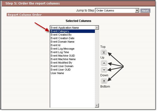
On the Order the Report Columns screen, set the order of your columns for your report. To move columns:
Highlight the column
Then click the Order buttons on the right side to re-order the columns.

Additionally, you can select certain Grand Totals and Percentages for your columns.
Available values are listed (These options may or may not apply to your set of data).
Each will have two checkboxes:
The checkbox to the left of the value is the Grand Total for that value.
The checkbox to the right of the value is the Overall Percentage for that column.
Note: If you select a percentage, you must add a label for that value.
On the Select Criteria page, finalize the options for the report, including the date range for the report as well as any additional filters you want to use. Simply select the appropriate field from the dropdown lists, and then use the filters to limit the report to data that fits within certain, more specific parameters to limit the report to records with specific data. See Creating Filters for more detailed information.
Click the Next button to create a report chart or click Run Report run the report.
Click the Save button to save the report.
DO NOT FORGET TO SAVE YOUR CUSTOM-CREATED REPORT!
When creating a new custom report, there are buttons available at the bottom of each Report Wizard screen that you can click at any time.
The following is a list of the available buttons with their functionality:
|
Run Report |
Click this to run the report. While you can run a report without saving it, running a report alone will not save a report |
|
Printable View |
Click this to load the report into Excel for printing. This gives you more control over how much is printed as well as on how many pages. |
|
Export |
Click this button to export the report into one of three (3) different formats: Excel (XLS), Acrobat (PDF), and Report Definition (XML) |
|
Save As |
Click this to save the report. |
|
Cancel |
Click this button to return to the screen where you clicked Create New Custom Report |
|
Back |
Click this button to go back one step |
|
Next |
Click this button to move forward to the next step |
|
Reports Home |
Click this button to return to the Reports Home screen |
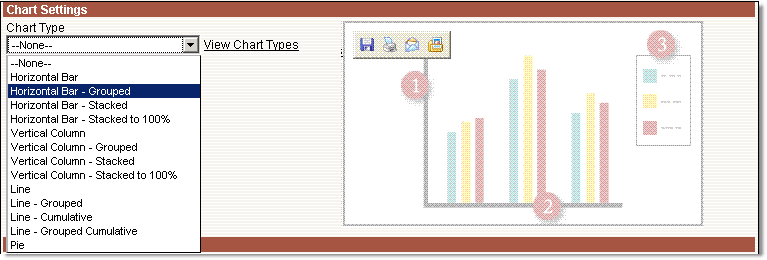
Charts are only available for Summary and Matrix reports. On the Select Charts and Highlights page, you can choose different chart settings to display your report data.

The following is a list of different chart types available for your selection:
Horizontal Bar Chart
Grouped Horizontal Bar Chart
Stacked Horizontal Bar Chart
100% Stacked Horizontal Bar Chart
Vertical Column Chart
Grouped Vertical Column Chart
Stacked Vertical Column Chart
100% Stacked Vertical Column Chart
Line Chart
Grouped Line Chart
Cumulative Line Chart
Grouped Cumulative Line Chart
Pie Chart
Once you select a chart type, you can specify the data to use for the chart. There are many different properties from which you can select when creating the chart.
Note: Negative numbers are not supported on stacked charts and pie charts.
The following is a list of Chart Properties. The report you select may or may not use some or all of these properties.
|
Y-Axis |
For Line / Column Charts - Select the data to display on the Y-axis |
|
X-Axis |
For Line / Column Charts - Select the data to display on the X-axis |
|
Groupings |
For Grouped / Stacked Charts - Select the type of data by which to group data on the chart |
|
Values |
For Pie Charts - Select the type of data to display as data values for the chart |
|
Wedges |
For Pie Charts - Select the type of data to display as the wedges in the chart |
|
Size |
Select the size of the chart |
|
Location |
Select where to place the chart in your report |
|
Title Options |
Give your chart a title as well as select the color and size of the title text |
|
Text Options |
Select the color and size of the text and labels in the chart |
|
Background Color |
Select a background color for the chart. |
|
Legend Position |
Choose where to display the chart legend in relation to the chart |
|
Show Axis Labels |
Check this box if you want the chart to display the labels for the X and Y axes in the chart |
Conditional highlighting is only available for Summary and Matrix reports. Use Conditional Highlighting to highlight specific summary data in the report cells. Commonly, this is used in conjunction with custom summary formulas to highlight certain high or low percentages, certain ratios, or averages. However, you can use it simply to highlight certain thresholds for activations (i.e., quotas or certain "break-even" activation numbers).

Select up to three different types of data from the report to use and then set thresholds and colors to use in the report:
See the following sections for additional information about more advanced features of report creation: